
Silverton Logo and its History
What is in our Logo?
Silverton’s logo, like the community, has a special history. In 1985, Silverton invited residents to design a logo to commemorate the 25th anniversary of the 1960 Census which made Silverton a City. Then-Silverton resident Jennifer Meldrum earned $100 for her design (bottom left).
Each of the four quadrants represented something about Silverton.
- An acorn and oak leaf represented not only Silverton’s vibrant urban forestry, but symbolized that “from little acorns, great oak trees grow.”
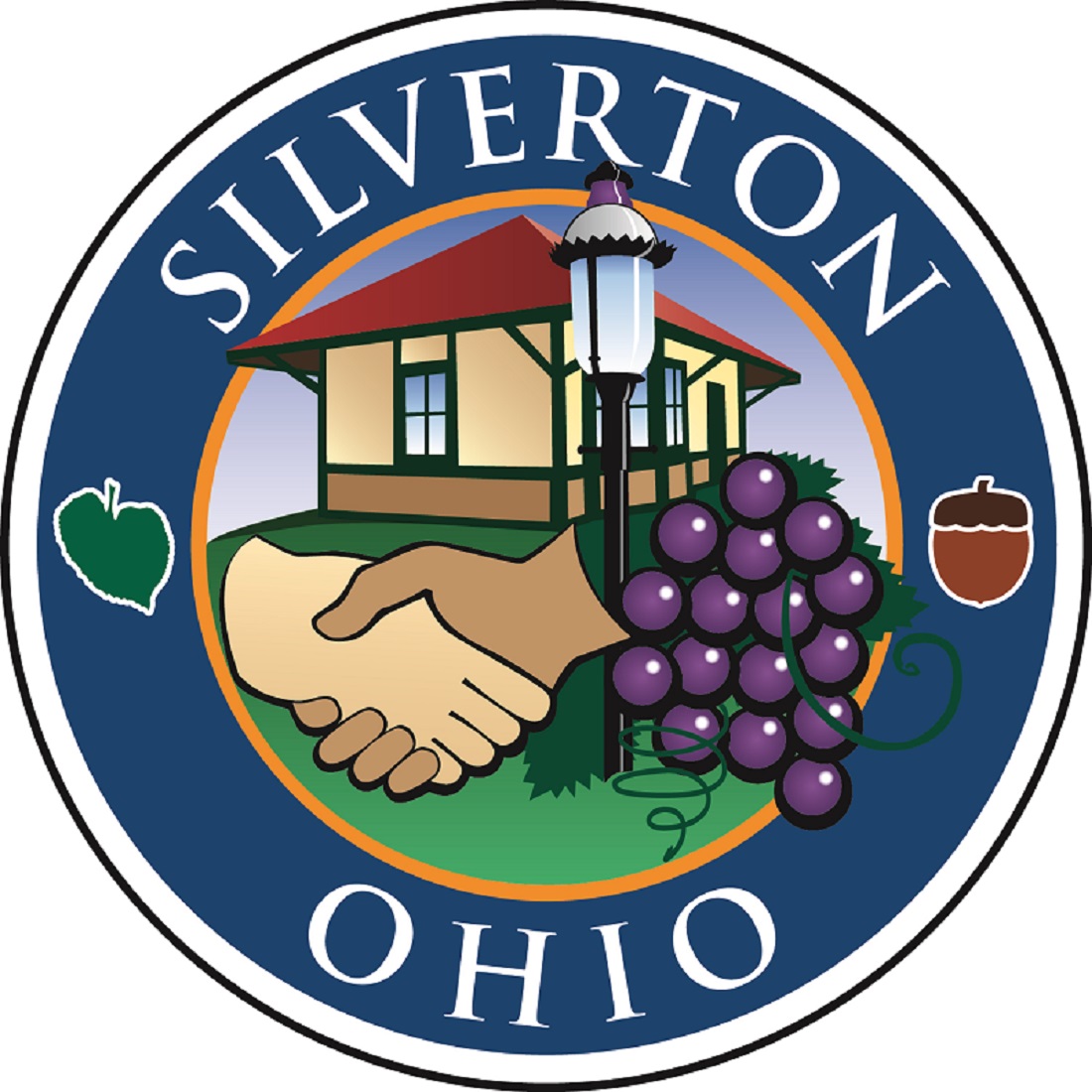
- The grapes stand for Silverton’s oldest and most unique business, Meier’s Winery, still producing wine and grape juice at 6920 Plainfield Road.
- The balanced scales represent justice.
- The clasped black and white hands symbolized brotherhood.
In 2006, Silverton adopted the motto, “A front porch community” and used the Silver Linden Leaf as its official symbol. The Silver Linden is still Silverton’s favored tree and is a symbol for the community (bottom right).
In 2014, Silverton combined these two symbols with its current logo. Silverton still uses the clasped hands of brotherhood and grapes to respect our community’s unique business history. We have modernized it a bit, adding our community’s most iconic structure, the Train Station in Silverton Park. The Silver Linden Leaf is still present opposite the acorn.
![]()
![]()